 TestMu 2025 - The Largest Virtual Software Testing Conference is Back | 50,000+ Attendees

Best 9 CSS Libraries for Developers and Designers [2025]
Tahera Alam
Posted On: April 16, 2025
 311013 Views
 15 Min Read
When you deal with dynamic and large-scale websites, CSS libraries can help provide pre-written code and reusable components for common elements of websites. This can save time and effort, produce more organized and maintainable code, and help avoid common CSS pitfalls, making the development process faster and more efficient.
TABLE OF CONTENTS
What Are CSS Libraries?
CSS libraries are pre-written collections of CSS code and styles you can use to quickly and easily style your web projects. They are reusable components created by developers to help solve common issues.
It typically includes styles for common elements such as buttons, forms, and navigation bars. They may also have styles for more specialized elements, such as graphs, charts, animations, etc.
Note: The term “library” is often used interchangeably with “framework”. While both aim to make development efficient by providing pre-built solutions for common tasks, they differ.
Top 9 CSS Libraries
Here are some of the top CSS libraries, known for their versatility, ease of use, and design consistency:
1. Animate.css
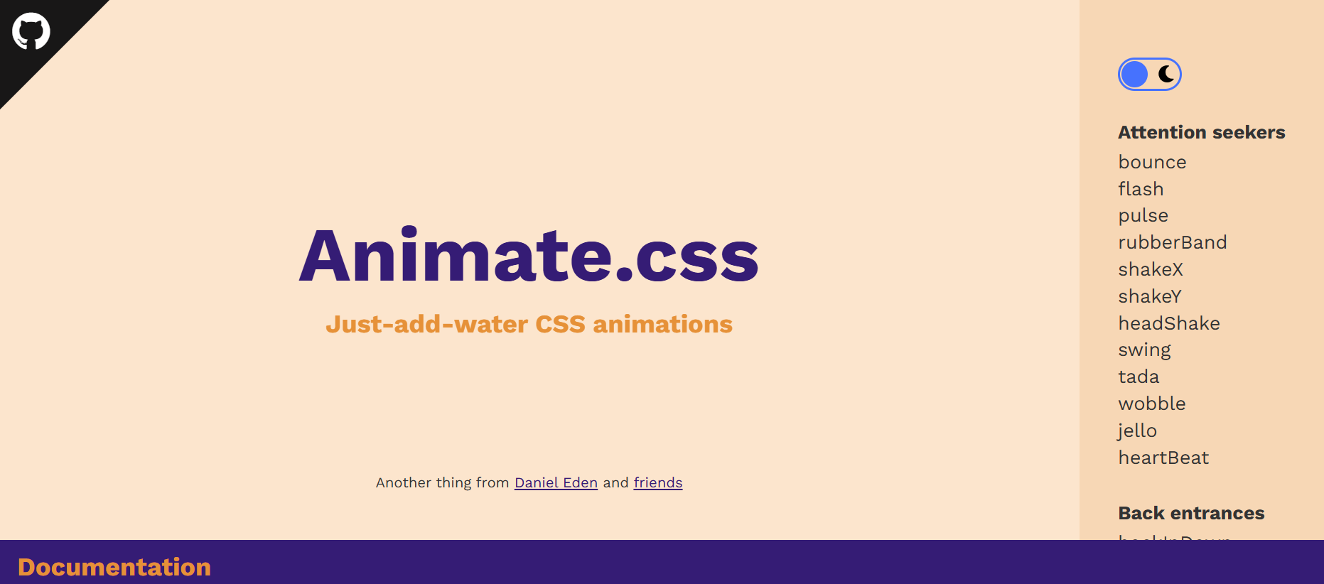
Animate.css provides a collection of pre-made CSS animations that can be easily integrated into a project. It allows you to add animations by simply adding CSS classes to HTML elements, making it easy to incorporate eye-catching animations without having to write extensive CSS code from scratch.
Example:
|
1 2 3 4 5 6 7 8 9 10 11 12 13 14 15 |
<link rel="stylesheet" href="https://cdnjs.cloudflare.com/ajax/libs/animate.css/4.1.1/animate.min.css" /> <div class="container"> <h1 class="animate__animated animate__bounce">LambdaTest</h1> <p> Discover the next-generation mobile apps and cross-browser testing cloud. </p> <button class="replay-button" onclick="replayAnimation()"> Replay Animation </button> |
Benefits:
- Ease to use: Animate.css is incredibly easy to use. You simply include the library, apply the appropriate class to an HTML element, and the animation is ready to go. This makes it accessible to both beginners and experienced developers.
- Cross-browser compatible: It is cross-browser compatible, so you can be sure your animations function perfectly on all latest and legacy browsers.
- Lightweight: Animate.css is very lightweight, so that it won’t add a lot of bloat to your website.
- Customizable: You can customize the animations by changing the duration, delay, and easing.
2. CSS Wand

CSS Wand is another versatile CSS library that offers an array of stunning animations you can easily incorporate into your project. It is a simple and intuitive tool that anyone can use, even if they don’t have any prior experience with CSS.
The best thing about CSS Wand is that it provides the CSS code for all the effects, which you can simply copy and paste into a project. You don’t need to install or write specific classes to apply those animations. All it takes is just the code provided by CSS Wand.
Example:
|
1 2 3 4 5 6 7 8 9 10 11 12 13 14 15 16 17 18 19 20 21 22 23 24 25 26 27 28 29 30 31 32 33 34 35 36 37 38 39 40 41 42 |
<!DOCTYPE html> <link rel="stylesheet" href="https://unpkg.com/css-wand/dist/wand.min.css" /> <style> .card { border: 1px solid #ccc; padding: 20px; border-radius: 12px; max-width: 500px; margin: 40px auto; box-shadow: 0 4px 10px rgba(0,0,0,0.1); } .card-title { font-size: 1.5rem; margin-bottom: 10px; } .card-description { font-size: 1rem; color: #333; } .card-footer { margin-top: 15px; font-size: 0.9rem; } </style> </head> <body> <div class="card wand-pop"> <div class="card-content"> <h2 class="card-title wand-fade-in">Cross-Browser Testing Made Easy</h2> <p class="card-description wand-slide-in-left"> LambdaTest is a cloud-based cross-browser testing platform that helps you ensure your website or web application looks and functions correctly across multiple browsers and devices. </p> </div> <div class="card-footer wand-bounce-in"> Learn more at <a href="https://www.lambdatest.com/" target="_blank">LambdaTest</a> </div> </div> </body> </html> |
Benefits:
- Easy to use: It is very easy to incorporate. Simply hover your mouse over the elements to see the effect and click on the one you like. CSS Wand will then generate the CSS code for that animation.
- Customizable: CSS Wand is highly customizable. You can customize the animations to your liking by adjusting the properties of the CSS code. This makes it easy to create animations that are unique and eye-catching.
3. Destyle.css

Destyle.css is a lightweight CSS reset library that removes the default styles for HTML elements. This allows you to start from a clean slate and apply your custom styles to all browsers.
It removes all of the default styles added by browsers, such as margins, padding, and font sizes, so you can be sure that your styles will look the same in all browsers.
Example:
|
1 2 3 4 5 6 7 8 9 10 11 |
<link href=" https://cdn.jsdelivr.net/npm/[email protected]/destyle.min.css " rel="stylesheet"> <h1>This is a Heading</h1> <p>This is a paragraph of text.</p> <ul> <li>Item 1</li> <li>Item 2</li> <li>Item 3</li> </ul> <a href="#">This is a link</a> |
Benefits:
- Ensures consistency: Destyle.css helps ensure browser consistency. You simply add a link to the Destyle.css file in your HTML, and it will automatically remove the default styles for all HTML elements. This ensures that your web page will look consistent across all browsers.
- Saves time and effort: Destyle.css eliminates the need to remove the default styles for each browser manually. This can save you time and effort, especially if you are working on a large-scale website.
- Small in size: It is made for modern browsers only, which means that it is small in size (~0.95KB). This makes it a lightweight CSS file that can be easily integrated into any website using a CDN or importing.
4. Picnic CSS

Picnic CSS is one of the most popular recent libraries out there, with popular websites like Dribble, CodePen, and Product Hunt using it.
It is a lightweight CSS library that is perfect for creating modern and responsive websites. It provides a set of neatly styled components ranging from buttons to cards, forms to tables, modals to navigation bars that you can easily incorporate into your project.
Picnic CSS is built on top of Normalize.css, providing a solid foundation for your HTML5 markup. It is a great choice when you want to create professional and performant websites without having to write a lot of CSS code.
Example:
|
1 2 3 4 5 6 7 8 9 10 11 12 13 14 15 16 17 18 19 20 21 22 23 24 25 26 27 28 29 30 31 32 33 34 35 36 37 38 39 40 41 42 43 44 45 46 47 48 49 50 |
<link href=" https://cdn.jsdelivr.net/npm/[email protected]/picnic.min.css " rel="stylesheet" /> <div class="tabs four"> <input id="tabC-1" type="radio" name="tabGroupC" checked /> <input id="tabC-2" type="radio" name="tabGroupC" /> <input id="tabC-3" type="radio" name="tabGroupC" /> <input id="tabC-4" type="radio" name="tabGroupC" /> <div class="row"> <div> <img src="https://images.unsplash.com/photo-1448375240586-882707db888b?ixlib=rb-4.0.3&ixid=M3wxMjA3fDB8MHxzZWFyY2h8Mnx8Zm9yZXN0fGVufDB8fDB8fHww&auto=format&fit=crop&w=600&q=60" /> </div> <div> <img src="https://images.unsplash.com/photo-1509773896068-7fd415d91e2e?ixlib=rb-4.0.3&ixid=M3wxMjA3fDB8MHxzZWFyY2h8MTZ8fGxha2V8ZW58MHx8MHx8fDA%3D&auto=format&fit=crop&w=600&q=60" /> </div> <div> <img src="https://plus.unsplash.com/premium_photo-1661884752233-eac0b5efe655?ixlib=rb-4.0.3&ixid=M3wxMjA3fDB8MHxzZWFyY2h8MTN8fGFpciUyMGJhbG9vbnN8ZW58MHx8MHx8fDA%3D&auto=format&fit=crop&w=600&q=60" /> </div> <div> <img src="https://images.unsplash.com/photo-1470252649378-9c29740c9fa8?ixlib=rb-4.0.3&ixid=M3wxMjA3fDB8MHxzZWFyY2h8MTZ8fHN1bnNldHxlbnwwfHwwfHx8MA%3D%3D&auto=format&fit=crop&w=600&q=60" /> </div> </div> <label for="tabC-1" ><img src="https://images.unsplash.com/photo-1448375240586-882707db888b?ixlib=rb-4.0.3&ixid=M3wxMjA3fDB8MHxzZWFyY2h8Mnx8Zm9yZXN0fGVufDB8fDB8fHww&auto=format&fit=crop&w=600&q=60" /></label> <label for="tabC-2" ><img src="https://images.unsplash.com/photo-1509773896068-7fd415d91e2e?ixlib=rb-4.0.3&ixid=M3wxMjA3fDB8MHxzZWFyY2h8MTZ8fGxha2V8ZW58MHx8MHx8fDA%3D&auto=format&fit=crop&w=600&q=60" /></label> <label for="tabC-3" ><img src="https://plus.unsplash.com/premium_photo-1661884752233-eac0b5efe655?ixlib=rb-4.0.3&ixid=M3wxMjA3fDB8MHxzZWFyY2h8MTN8fGFpciUyMGJhbG9vbnN8ZW58MHx8MHx8fDA%3D&auto=format&fit=crop&w=600&q=60" /></label> <label for="tabC-4" ><img src="https://images.unsplash.com/photo-1470252649378-9c29740c9fa8?ixlib=rb-4.0.3&ixid=M3wxMjA3fDB8MHxzZWFyY2h8MTZ8fHN1bnNldHxlbnwwfHwwfHx8MA%3D%3D&auto=format&fit=crop&w=600&q=60" /></label> </div> |
Benefits:
- Lightweight and mobile-friendly: Picnic CSS is lightweight and mobile-friendly, with a compressed size of only 10KB for a better and faster mobile load. This makes it a great choice for building mobile-first websites.
- Responsive: It is responsive, so your website will look great on all devices, from desktops to mobile phones. This is important for ensuring that your website is accessible to everyone.
- Documented: Picnic CSS has comprehensive documentation that makes it easy to learn and use. The documentation includes tutorials, examples, and references, making it easy to find the information you need to start with Picnic CSS.
5. Balloon.css

Balloon.css is a tooltip library that lets you add tooltips to elements without writing any JavaScript code.
It makes the creation of tooltips simpler than ever before. With Balloon.css, you just need to add an attribute to your preferred tooltip element, and it’s done. You can easily customize the tooltip’s position with properties like up, down, left, right, up-left, up-right, etc. You can also customize its color, length, font size, etc.
Example:
|
1 2 3 4 5 6 7 8 9 |
<link rel="stylesheet" href="https://unpkg.com/balloon-css/balloon.min.css" /> <div class="container"> <button aria-label="Whats up!" data-balloon-pos="up" class="button"> Hover me! </button> </div> |
Benefits:
- Lightweight: Balloon.css is a lightweight library, weighing only about 1.1KB when minified, which helps keep your load times fast.
- Documentation: Balloon.css is documented with a detailed explanation of how to use the library. This makes it easy to start with Balloon.css, even if you are unfamiliar with CSS.
- No JavaScript dependencies: It does not require any JavaScript. This makes it a good choice for websites that want to avoid using JavaScript.
- Highly customizable: Balloon.css is highly customizable, with various options available to change the appearance of the tooltips. This includes the ability to change the color, font size, position of the tooltips, etc.
- Programmatic control: It allows you to programmatically show tooltips even when user interaction isn’t happening, providing flexibility in tooltip display.
6. Water.css

Water.css is a lightweight and minimalistic CSS framework designed to enhance the styling of simple websites without requiring you to write additional CSS classes. It’s an ideal choice when you don’t want to spend time styling a page but also don’t want the ugliness of default styles.
The best thing about Water.css is that it doesn’t require any classes. You just include it in your HTML head, and it silently makes everything nicer.
Example:
|
1 2 3 4 5 6 7 8 9 10 11 12 13 14 15 16 17 18 19 20 21 22 23 24 25 26 27 28 29 30 31 32 33 34 35 36 37 38 39 40 41 42 43 44 |
<link rel="stylesheet" href="https://cdn.jsdelivr.net/npm/water.css@2/out/light.min.css" /> </head> <body> <header> <h1>Testing Made Easy with LambdaTest</h1> <p>Your Solution for Cross-Browser Testing</p> </header> <div class="main-content"> <h2>Introduction to LambdaTest</h2> <p> LambdaTest is a cloud-based testing platform that makes it easy for developers and testers to ensure their web applications work seamlessly across various browsers and operating systems. </p> <img src="https://www.lambdatest.com/resources/images/main/home_banner.webp" alt="lambdatest-home-banner" /> <h2>Key Features</h2> <ul> <li>Real-time testing on 2000+ browsers and devices.</li> <li>Automated testing with Selenium and other frameworks.</li> <li>Integrated debugging tools for quick issue resolution.</li> <li>Collaboration features for cross-functional teams.</li> <li>Test your locally hosted web pages.</li> </ul> <h2>Try LambdaTest Today!</h2> <p> Ready to streamline your testing process? Click the button below to sign up for a LambdaTest account and start testing your web applications effortlessly. </p> <a href="https://www.lambdatest.com/" class="btn" target="_blank" >Get Started with LambdaTest</a > </div> </body> |
Benefits:
- Easy to use: Water.css is easy to use, even for beginners. You don’t need to incorporate any classes or dependencies for using water.css. You just stick one of these in HTML, and you are done.
- Lightweight: Water.css is only 2KB in size, which means it will not slow down your website.
- Responsive: Water.css comes with out-of-the-box responsiveness, so your pages look great on any device.
- Dark mode support: Water.css supports dark mode so that you can choose the preferred mode.
7. Hover.css

Hover.css is a collection of pre-designed animations and transitions that you can easily apply to elements like links, buttons, logos, SVGs, images, and more.
With Hover.css, you can effortlessly make buttons grow when hovered over, images zoom in, backgrounds change color from left to right, navigation menus dynamic with a bounce, form inputs respond to user actions with a subtle pulse, and even add flair to social media icons.
When it comes to incorporating Hover.css in your project, you have more than one option of adding it. You can either copy and paste a specific effect’s CSS code into your stylesheet or reference the entire Hover.css stylesheet.
Example:
|
1 2 3 4 5 6 7 8 9 10 11 12 13 14 15 16 17 18 19 20 21 22 23 24 25 26 27 28 29 30 31 32 33 34 35 36 37 38 39 40 41 42 43 44 45 46 47 48 49 50 51 52 53 54 55 56 57 58 59 60 61 62 63 64 65 66 67 68 69 70 71 72 73 74 75 76 77 78 79 80 |
<nav class="navbar"> <div class="navbar-logo"> <img src="https://www.lambdatest.com/resources/images/logos/logo.svg" alt="lambdatest" /> </div> <ul class="navbar-items"> <li class="navbar-item hvr-underline-from-center"> <a href="https://www.lambdatest.com/feature" class="navbar-link" target="_blank" >Platform</a > </li> <li class="navbar-item hvr-underline-from-center"> <a href="https://www.lambdatest.com/enterprise" class="navbar-link" target="_blank" >Enterprise</a > </li> <li class="navbar-item hvr-underline-from-center"> <a href="https://www.lambdatest.com/blog" class="navbar-link" target="_blank" >Resources</a > </li> <li class="navbar-item hvr-underline-from-center"> <a href="https://www.lambdatest.com/support/docs/getting-started-with-lambdatest-automation/" class="navbar-link" target="_blank" >Developers</a > </li> <li class="navbar-item hvr-underline-from-center"> <a href="https://billing.lambdatest.com/billing/plans" class="navbar-link" target="_blank" >Pricing</a > </li> </ul> <ul class="navbar-items"> <li class="navbar-item hvr-underline-from-center"> <a href="https://accounts.lambdatest.com/dashboard" class="navbar-link" target="_blank" >Dashboard</a > </li> <li class="navbar-item"> <a href="https://billing.lambdatest.com/billing/plans" class="navbar-button" target="_blank" id="upgrade" >Upgrade</a > </li> <li class="navbar-item"> <a href="https://www.lambdatest.com/demo" target="_blank" class="navbar-button" id="bookDemo" >Book a Demo</a > </li> </ul> </nav> </body> </html> |
Benefits:
- Easy to use: Hover.css is a self-contained library, so you can easily copy and paste the effects you want to use in your own stylesheet.
- Wide browser support: Hover.css supports a wide range of browsers, including Chrome, Firefox, Safari, Edge, and Opera.
- Customizable: You can customize the hover effects to fit your needs.
8. Pattern.css

Pattern.css is a collection of stunningly beautiful patterns that you can easily incorporate into your projects. You can apply those patterns as hero backgrounds, text fills, separators, and more.
It provides various patterns, including horizontal and vertical lines, checks, zigzags, dots, cross dots, grids, diagonal patterns, horizontal stripes, vertical stripes, etc. It is also highly customizable and allows you to change the size of each pattern with Bootstrap-like classes such as sm, md, lg, xl, etc.
Example:
|
1 2 3 4 5 6 7 8 9 10 11 12 13 14 15 |
<link href="https://unpkg.com/pattern.css" rel="stylesheet" /> <div class="container pattern-vertical-lines-md"> <h1 class=""> Next-Generation Mobile Apps and <br /> Cross Browser <span>Testing Cloud</span> </h1> <p> Deliver unparalleled digital experience with our next-gen AI-powered testing cloud platform. Ensure exceptional user experience across all devices and browsers. </p> <button> <a href="https://www.lambdatest.com/" target="_blank">Try now</a> </button> </div> |
Benefits:
- Easy to use: It is easy to use, even if you have no prior knowledge of CSS. Simply include the pattern.css stylesheet in your HTML document and add pattern.css classes to your HTML elements to apply the desired patterns.
- Compatible with frameworks like Bootstrap: It can be used alongside CSS frameworks, such as Bootstrap. This allows the mixing and matching of different CSS components to create unique and custom designs.
- Dynamic patterns: pattern.css patterns are not static PNG files but CSS code. This means you can customize the patterns to match your preferences, such as color, size, and opacity.
9. Pure.css
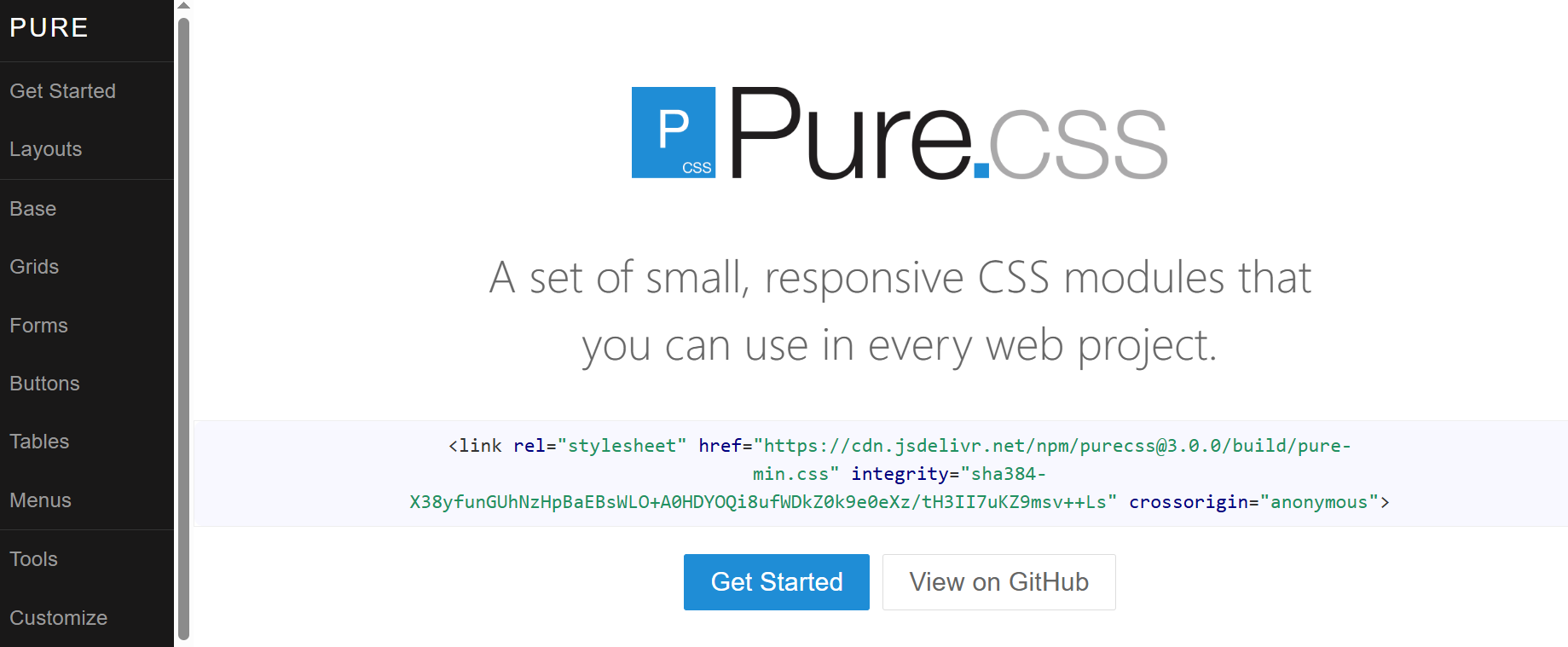
Pure.css is a lightweight library that provides a set of basic CSS modules for building responsive, accessible, cross-browser-compatible websites and web applications.
It uses a mobile-first approach, which makes it an excellent choice for projects where you need to focus on mobile devices. It includes modules for forms, buttons, menus, tables, navigation bars, etc.
Example:
|
1 2 3 4 5 6 7 8 9 10 11 12 13 14 15 16 17 18 19 20 21 22 23 24 25 26 27 28 29 30 31 32 33 34 35 36 37 38 39 40 41 42 43 44 45 46 47 48 49 50 51 52 53 54 55 56 57 58 59 60 61 62 63 64 65 66 67 68 69 70 71 72 73 74 75 76 77 78 79 80 81 82 83 84 85 86 87 88 89 90 91 92 93 94 95 96 97 98 99 100 101 102 103 104 105 106 107 108 109 110 111 112 113 114 115 116 117 118 119 120 121 |
<link rel="stylesheet" integrity="sha384-X38yfunGUhNzHpBaEBsWLO+A0HDYOQi8ufWDkZ0k9e0eXz/tH3II7uKZ9msv++Ls" crossorigin="anonymous" /> <link rel="stylesheet" href="https://cdn.jsdelivr.net/npm/[email protected]/build/grids-responsive-min.css" /> <div class="banner"> <h1 class="banner-head"> LambdaTest Manual Testing Pricing.<br /> Try before you buy. </h1> </div> <div class="pricing-container"> <div class="pricing-tables pure-g"> <div class="pure-u-1 pure-u-md-1-3"> <div class="pricing-table pricing-table-free"> <div class="pricing-table-header"> <h2>Free</h2> <span class="pricing-table-price"> $0 <span>per month</span> </span> </div> <ul class="pricing-table-list"> <li>Live real time testing</li> <li>200+ Desktop Browsers</li> <li>10 Screenshot Tests per month</li> <li>10 Responsive Test per month</li> <li>3 sessions of Native App Testing on Emulators/Simulators</li> </ul> <a class="button-choose pure-button" href="https://www.lambdatest.com/pricing" target="_blank" >Choose</a > </div> </div> <div class="pure-u-1 pure-u-md-1-3"> <div class="pricing-table pricing-table-biz pricing-table-selected"> <div class="pricing-table-header"> <h2>Live</h2> <span class="pricing-table-price"> $15 <span>per month </span> </span> </div> <ul class="pricing-table-list"> <li>Unlimited Live Real Time Testing</li> <li>3000+ Desktop Browsers</li> <li>Unlimited Screenshot Testing</li> <li>Unlimited Responsive Testing</li> <li>Emulators / Simulators for web and app testing</li> <li>Geolocation Testing</li> <li>Web and mobile debugging tools</li> <li>Integrate with JIRA, Asana, Slack</li> </ul> <a class="button-choose pure-button" href="https://www.lambdatest.com/pricing" target="_blank" >Choose</a > </div> </div> <div class="pure-u-1 pure-u-md-1-3"> <div class="pricing-table pricing-table-enterprise"> <div class="pricing-table-header"> <h2>Real Device</h2> <span class="pricing-table-price"> $25 <span>per month </span> </span> </div> <ul class="pricing-table-list"> <li>Real Mobile devices</li> <li>Test native, hybrid, and web apps</li> <li>App Uploads</li> <li>Natural gestures and interactions</li> <li>Network Throttling</li> <li>Detailed device and app/crash logs</li> <li> Integrate with AppStore,PlayStore, AppCenter and TestFlight </li> <li>GPS based geolocation testing and more</li> </ul> <a class="button-choose pure-button" href="https://www.lambdatest.com/pricing" target="_blank" >Choose</a > </div> </div> </div> </div> |
Benefits:
- Lightweight: Pure.CSS is very lightweight, with the entire set of modules weighing just 3.5KB minified and gzipped. This means that websites built with Pure.CSS will load quickly and efficiently.
- Accessible: It is designed to be accessible to all users, including users with disabilities. Pure.CSS uses CSS best practices and follows the W3C’s Web Content Accessibility Guidelines (WCAG).
- Flexible and customizable: Pure.CSS is designed to be unopinionated, allowing you to customize it to match your design requirements.
- Responsive: Pure.CSS includes a responsive grid system that will automatically adjust to different screen sizes and devices.
- Cross-browser compatible: It is cross-browser compatible, so your website will look good and function on all browsers.
Why Should You Use CSS Libraries?
CSS libraries offer an array of benefits over writing custom CSS. They provide a solid foundation for building visually appealing, responsive, and user-friendly websites while saving time and promoting design consistency.
Benefits:
- Faster Development: CSS libraries speed up the process by offering prebuilt components for various elements, reducing the need to code from scratch.
- Consistency: They come with standardized elements and style guidelines, ensuring a cohesive look across the site, crucial for branding and user experience.
- Responsive Design: Most libraries include built-in responsive features, making it easier to create websites that adapt to all screen sizes.
- Performance Optimization: Many CSS libraries are designed with performance in mind. They use techniques like minification and efficient CSS code to ensure that web pages load quickly.
- Improved Accessibility: Another significant advantage of utilizing CSS libraries is their focus on accessibility. Many CSS libraries prioritize accessibility, ensuring that their styles and components comply with accessibility standards.
- Cross Browser Compatibility: These libraries are typically tested, providing CSS code that works consistently across web browsers. This eliminates the need to debug and fix browser-specific issues.
Criteria for Selecting CSS Libraries
Note that the best library for your project will vary depending on your specific project requirements. However, to assist you in making an informed choice, here are some key criteria to consider when selecting the right CSS libraries:
- Performance considerations: Look for libraries that are optimized for speed and efficiency. A good library should not add unnecessary bloat to your website, which could slow it down.
- Compatibility and browser support: The success of your website depends heavily on its ability to function flawlessly across a wide range of browsers and devices.
- Ease of use and documentation: The documentation should provide clear step-by-step instructions, examples, and practical usage guidelines.
- Customizability and flexibility: Check if the library provides variables, mixins, or other mechanisms for you to tailor the styles to match your project’s branding and design needs.
Check if the library’s code is minified or compressed, as smaller file sizes load faster.
This is important for several reasons such as wider audience, user experience and search engine optimization.
This way, you can quickly understand how to maximize the library’s capabilities without hassle. A good library will simplify your development and save you time.
Highly customizable libraries enable you to create a unique and visually appealing user interface while benefiting from pre-built components and functionality.
To ensure CSS libraries are compatible with the latest browser versions, you can test your website using a cross browser testing platform like LambdaTest. LambdaTest is an AI-native test execution platform that allows you to test your website on an remote test lab of different browsers, real devices and operating systems.
Conclusion
CSS libraries are a robust way of building modern and inclusive websites. By choosing the right library for your web project, you can streamline your workflow, produce high-quality, maintainable code, and deliver a seamless user experience worldwide.
However, with the vast number of CSS libraries available, choosing the right one for your project can be challenging. So, in this blog, we have handpicked the best 9 CSS libraries for you to leverage. While choosing these libraries, we considered factors like ease of use, popularity, use cases, clear documentation, browser support, and flexibility.
Frequently Asked Questions (FAQs)
Which is the best CSS library?
The best CSS library depends on project needs; popular choices include Bootstrap for its extensive components, Foundation for flexibility, and Materialize for material design aesthetics.
Is Bootstrap a library for CSS?
Yes, Bootstrap is a widely-used CSS library known for its comprehensive set of ready-to-use components for responsive web design.
What are libraries in HTML and CSS?
Libraries in HTML and CSS are pre-written collections of code that help developers build websites faster and more efficiently.
Will using a CSS library slow down my website?
It depends on how it’s implemented. Using only the necessary components or customizing builds can minimize performance impact.
Can I use multiple CSS libraries together?
Technically yes, but it may cause conflicts or style overrides if not managed carefully.


Author’s Profile
Tahera Alam
Tahera is a front-end developer who loves developing seamless frontends and efficient backends. She has skills in React, JavaScript, Nextjs, Tailwind, MongoDB, Solidity, and more. She loves to learn new technologies and finds writing about them to be a great way to share knowledge with others. In her free time, she enjoys reading thrillers and engaging with the tech community on Twitter.
Blogs: 12
Got Questions? Drop them on LambdaTest Community. Visit now